Evolving the art of the game
Dear friends and foes of democracy,
In the last 6 months, our team has been working on finding the exact art style for our game. We did many attempts, checked with experienced designers, added layers and effects... We think we are 95% there now.
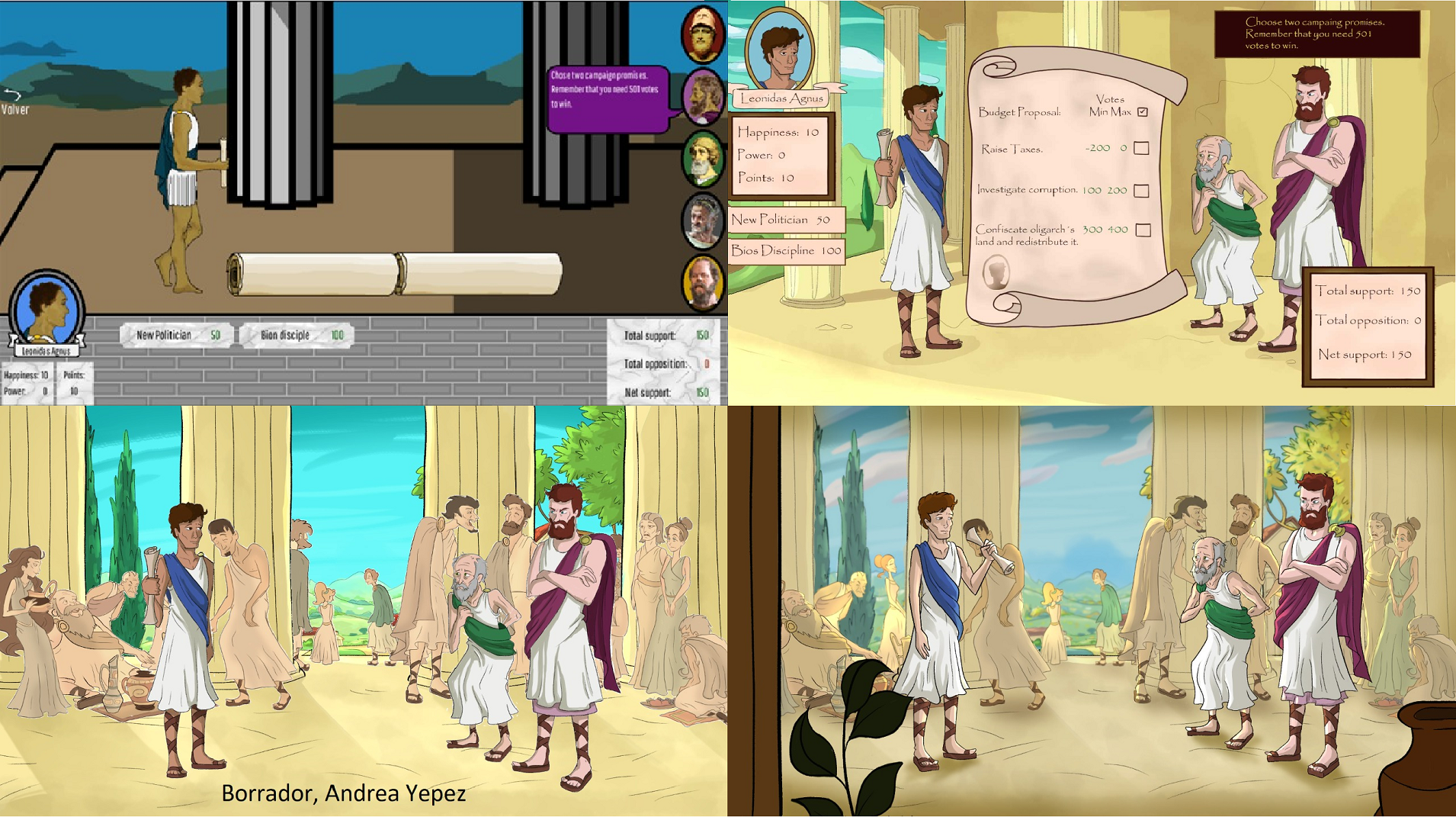
The four images below show how the design of the same image has progressed.
The first image (top left) is what I drew back in december 2020, when the first playable version of Socratic Democracy was created. The current game that you can play on itch io still uses that art.
The second image (top right) is what Andrea Yepez produced in the selection process to work for the game (october or november 2021).
The third image (bottom left) is the first complete image Andrea made after she was hired (meaning, the only one with shadows, color etc), in June or July this year. The noise you see there is actually my fault, as I composed the image using the wrong software.
The fourth image (bottom right) was revealed today. It uses blur, saturation and light incidence to pass the idea of volume and call attention to the protagonists of the story. Characters have much better poses than before. A foreground layer was also incorporated. Shadows were also enhanced (though I see a few places where it can be further improved). Lines pointing to the main character were added.

We are very pleased. We feel like we found the art style that this game requires.
I see many game developers, including Godot's founder Juan Linietsky, commenting that art can be added at a later stage of the game, that teams should not be too distracted by adding art before they have all the core elements working. This is probably right, and our team must work hard to build up the next version of the game and testing it before the final art is ready. However, having an art style that inspires and truly captures the essence of the game is also a necessity. We left the meeting today motivated, full of ideas for the next steps.
We hope you, readers of this devlog, as well as our future players, will enjoy this art as well.
Cheers,
Pedro
(The Democratic Socratic team is made of Pedro Nunes, Susan Barreiros and Andrea Yepez).
Files
Get Socratic Democracy
Socratic Democracy
Play as a politician in an ancient greek city state called Foititia.
| Status | Prototype |
| Author | pedrorns |
| Genre | Educational, Simulation |
| Tags | ancient-greece, based-on-a-book, democracy, Godot, philosophy, Point & Click, politics, Short |
| Languages | English, Spanish; Latin America, Portuguese (Brazil) |
More posts
- Presenting Dimitria, the first oligarch designedJun 26, 2025
- Scenario TestMay 27, 2025
- The cemeteryMay 17, 2025
- The LibraryApr 11, 2025
- Improving the city. Part II: Adding remaining elementsApr 05, 2025
- Improving the city. Part I: GreeknessMar 19, 2025
- One year in the life of an ancient Greek city (new video)Feb 17, 2025
- Presenting the main charactersJul 02, 2024
- Poor Neighborhood: where campaigns take formJun 25, 2024
- Making the AgoraJun 03, 2024
Comments
Log in with itch.io to leave a comment.
I see you guys have been working hard on the art but I'm not saying it looks bad (in fact it's very good) but I just feel it's a little bit out of place for a game with backstabbing and Military coup it feels like a cartoon
I feel like a more Greek and mature art style will look better
Hi there, ma King! I love that you took the time to not only write this message, which makes a lot of sense, but also find examples of art that feels more adult. I do appreciate as well your positive comments on the direction of the art we are currently producing.
I actually can't fully explain the reasons behind the art direction we are taking. I feel like such choice should take into consideration aspects of game development that I ignore, including how art affects marketing potential. I also lack an art background, which could help me rationalize my thoughts. But here are some of the reasons for the art been as it is:
1) Cost. A more adult aesthetic tends to be harder (and thus, costlier) to make. You may notice that the style we are using can get away with simple textures and shadows.
2) Originality. When searching for an artist, we did get some proposals that looked more adult. But they looked like many other games out there, such as "Old World". It felt like we would have less of an original identity.
3) Contrast. I like the contrast between an innocent and even children's book art and the actual violence of the story. I have seen plenty of animes that have that. Which makes me think that it is not so unusual, and can be used to great effect.
4) Practicality. Our team is so small, and our money and time so scarce, that we can't afford to take a deeper dive into art styles. But you make me think that I should consult some friends on the topic, and perhaps do some adjustments.
Again, thanks for the interest, and hope to see you around here more often. Except that... our democracy was born by killing the elites, even Kings!! Beware!
Cheers!